The one thing to watch
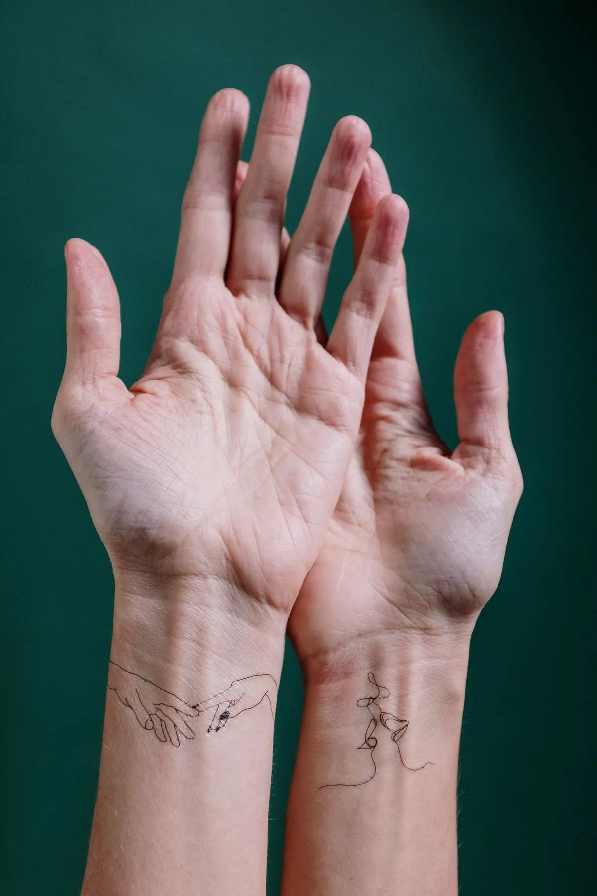
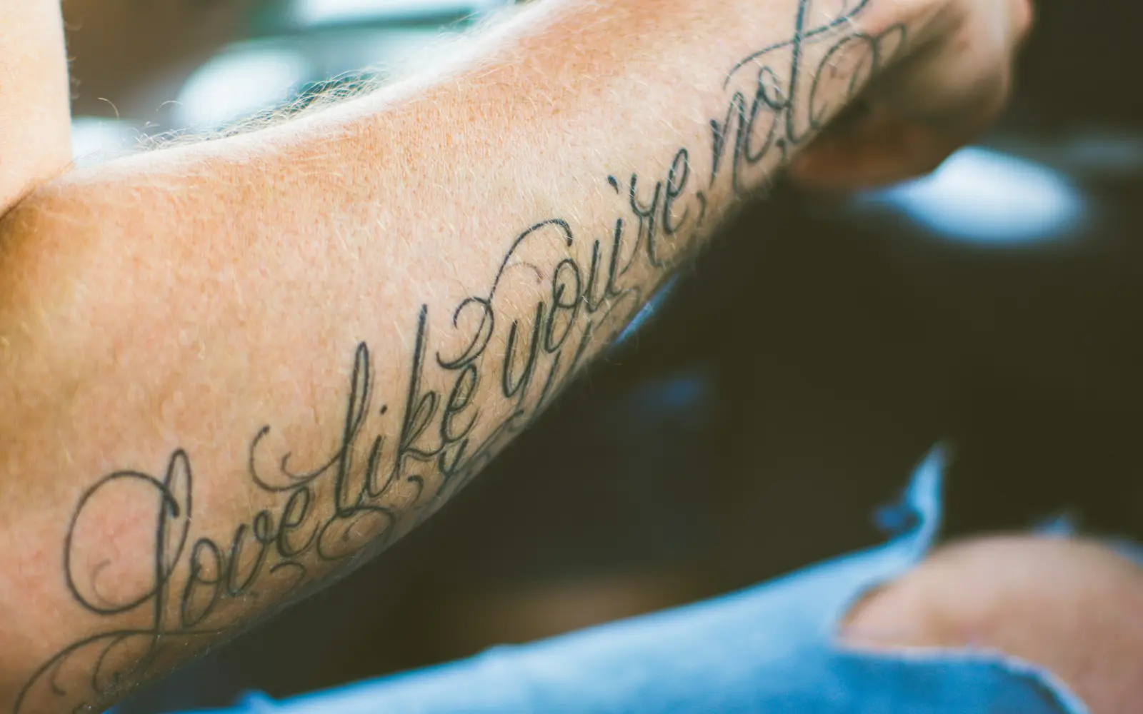
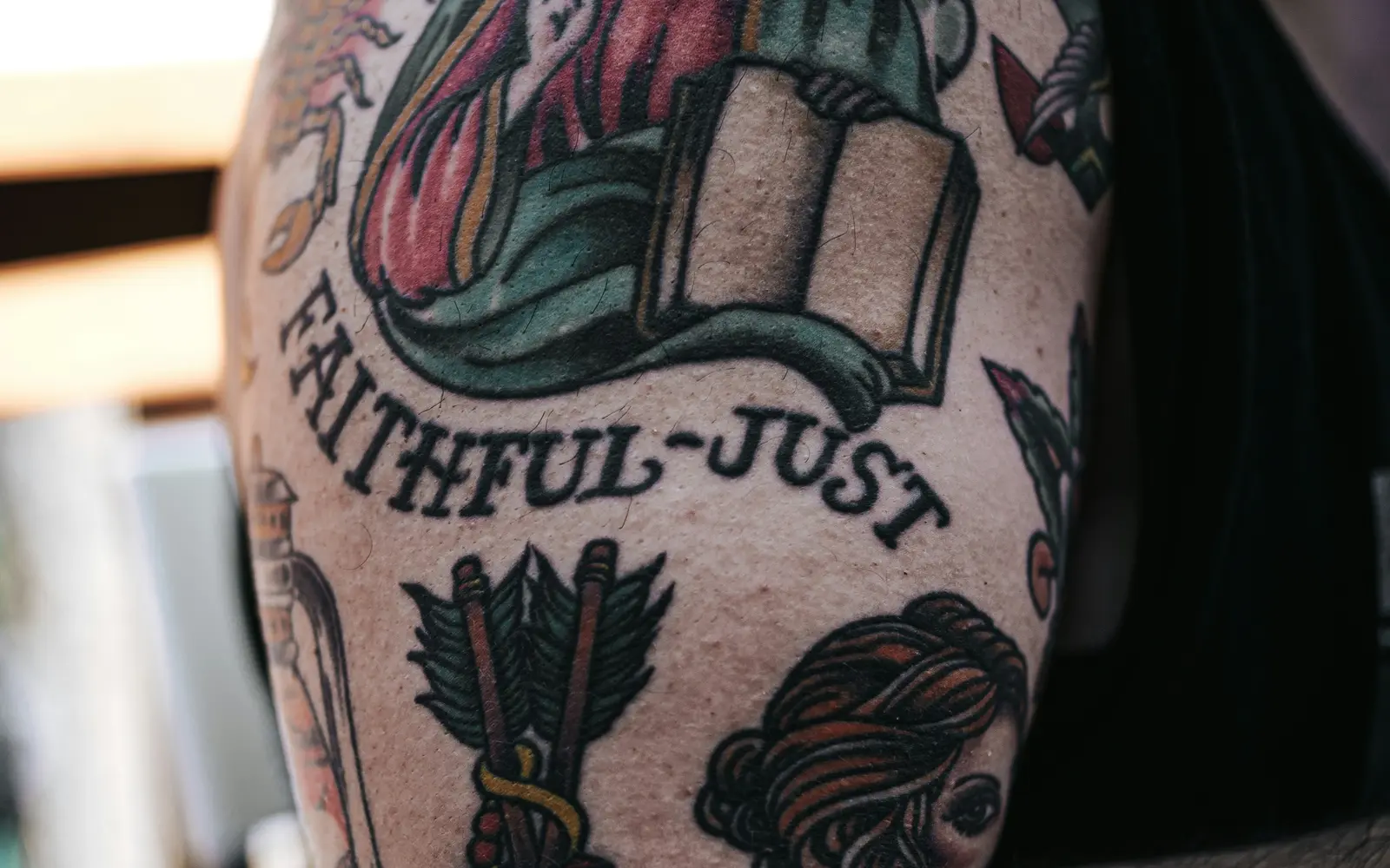
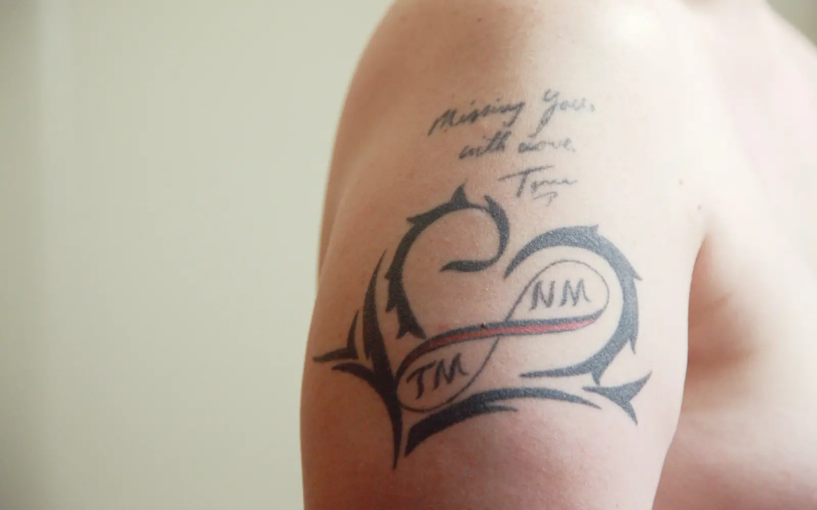
Small dates and names. Give text enough size to stay legible.
What the style itself demands
From the Memorial style guide, the rules that decide how well it lasts:
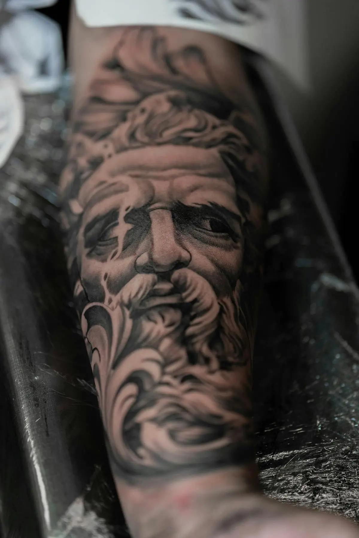
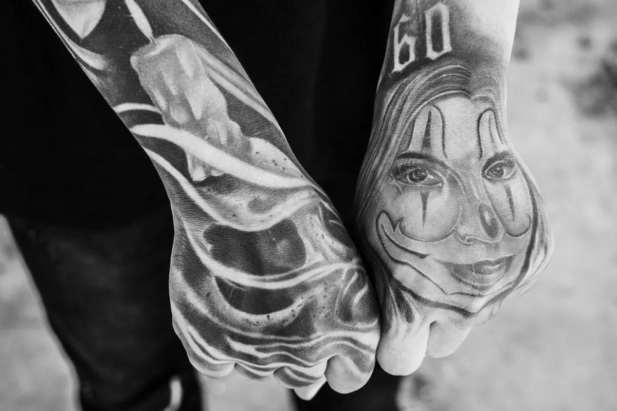
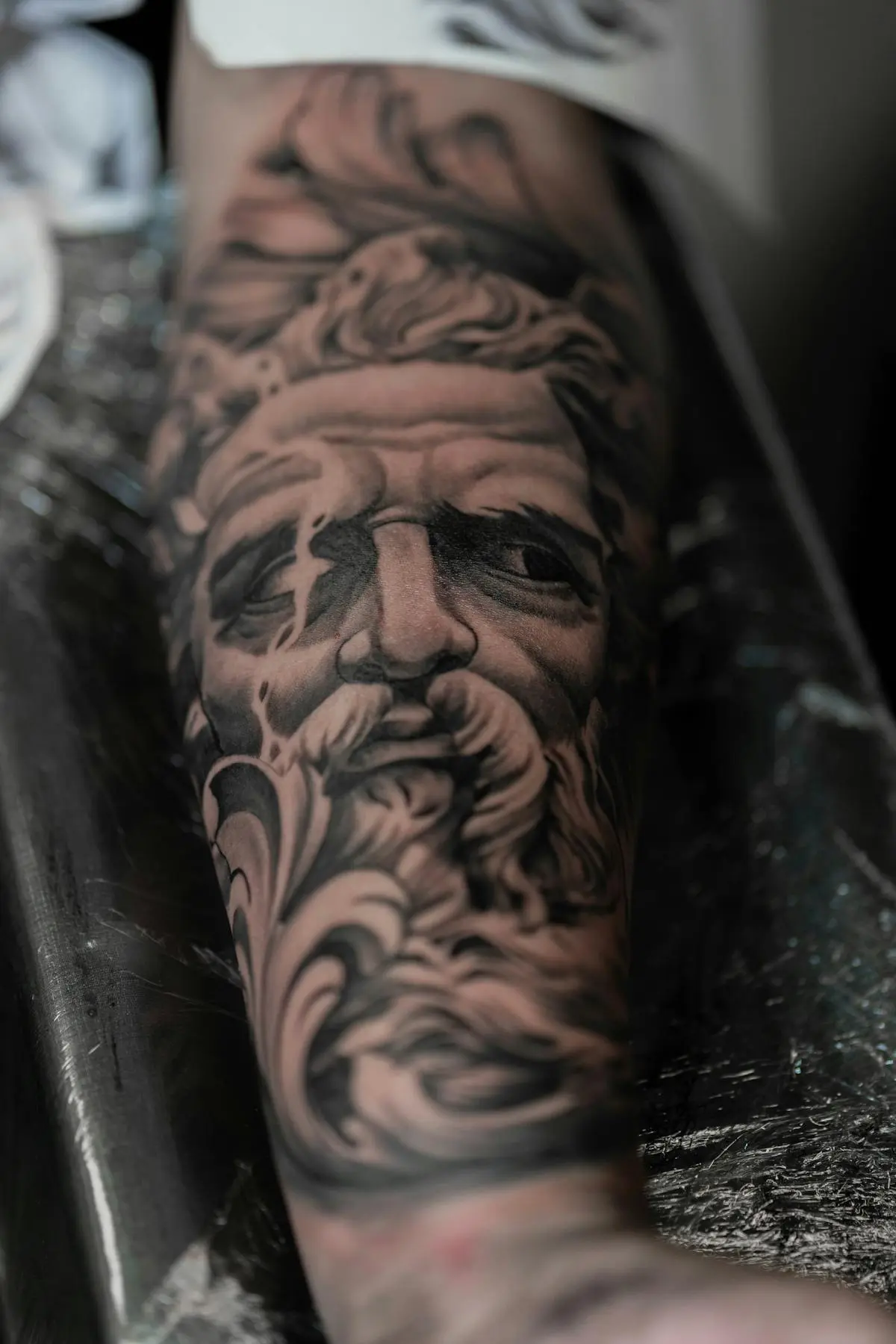
- For a portrait, hire a true portrait specialist and judge healed work only: fresh portraits always look sharp; the test is how the likeness holds after it settles. Realism and black-and-grey artists who post healed, years-old portraits are the ones to trust with a face that has to stay recognizable.
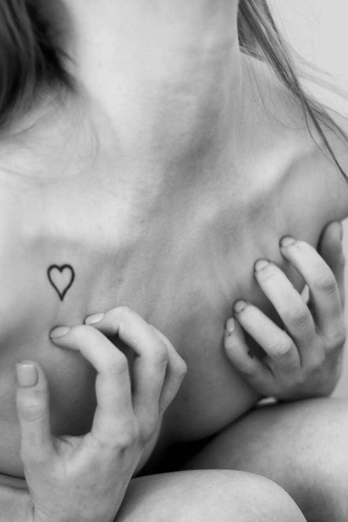
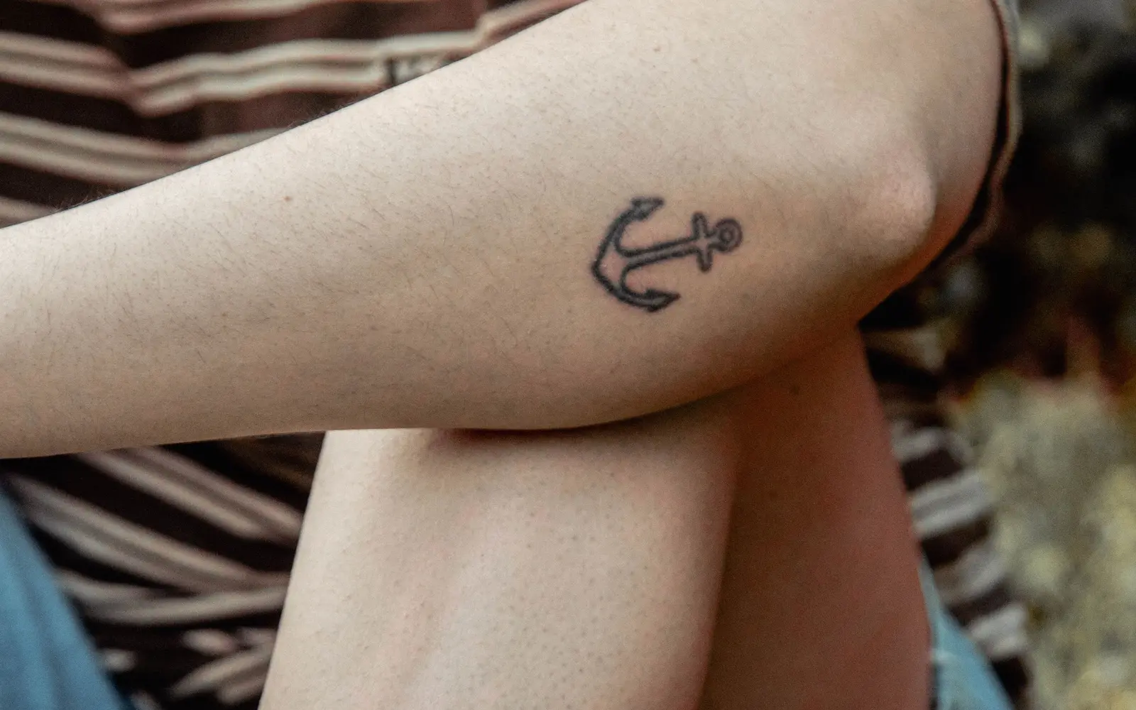
- Choose a symbol over a forced likeness when the reference is weak: if the only photos are blurry, a meaningful object, flower, date, coordinates, or short phrase will age better and hurt less than a portrait that never quite looks like them. A symbol that's truly 'theirs' often lands harder than a face.
- Don't decide in the first weeks of grief: there's no deadline. Sit with the concept, the placement, and the artist choice for a while. The tattoo will mean more when it comes from a settled decision, not an acute moment.
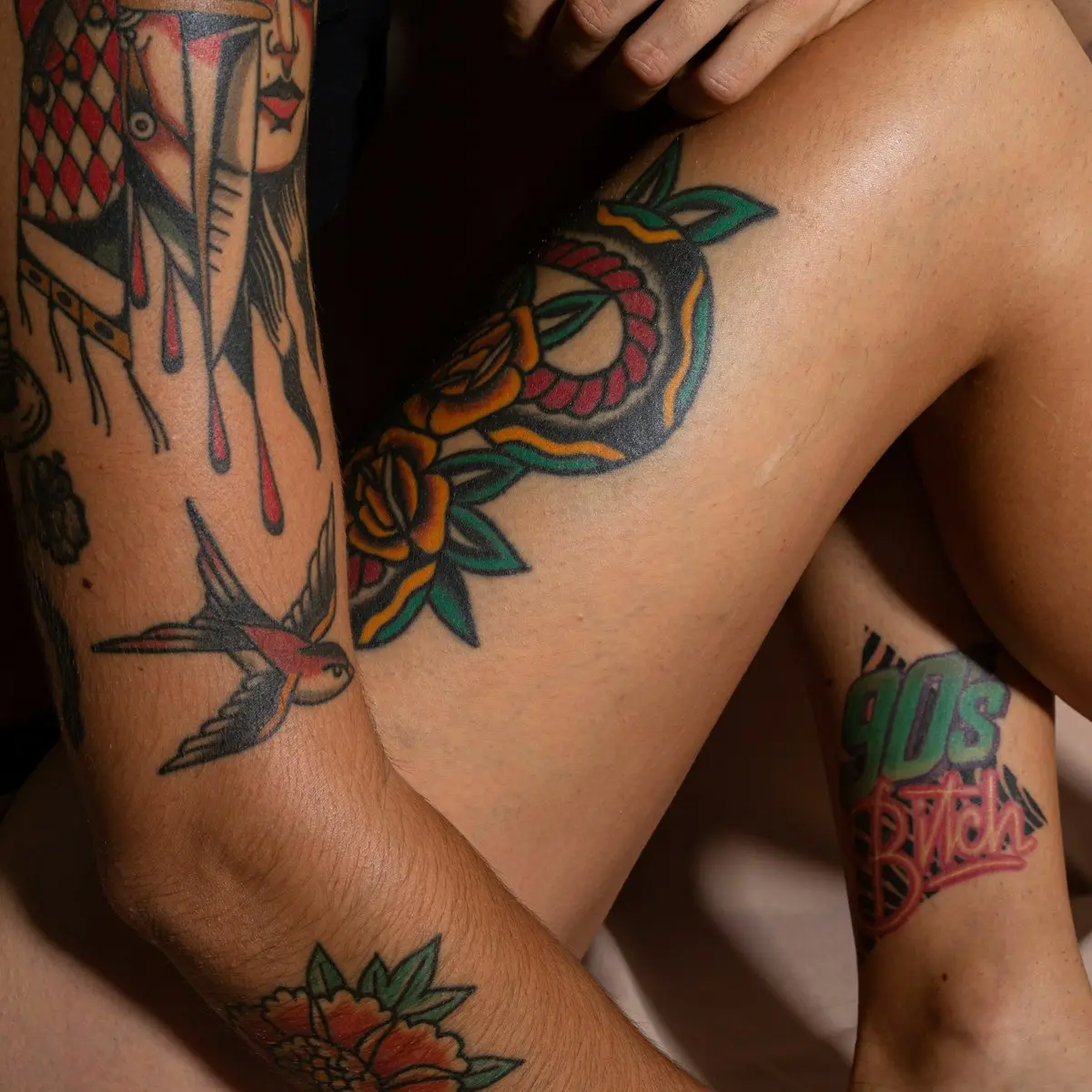
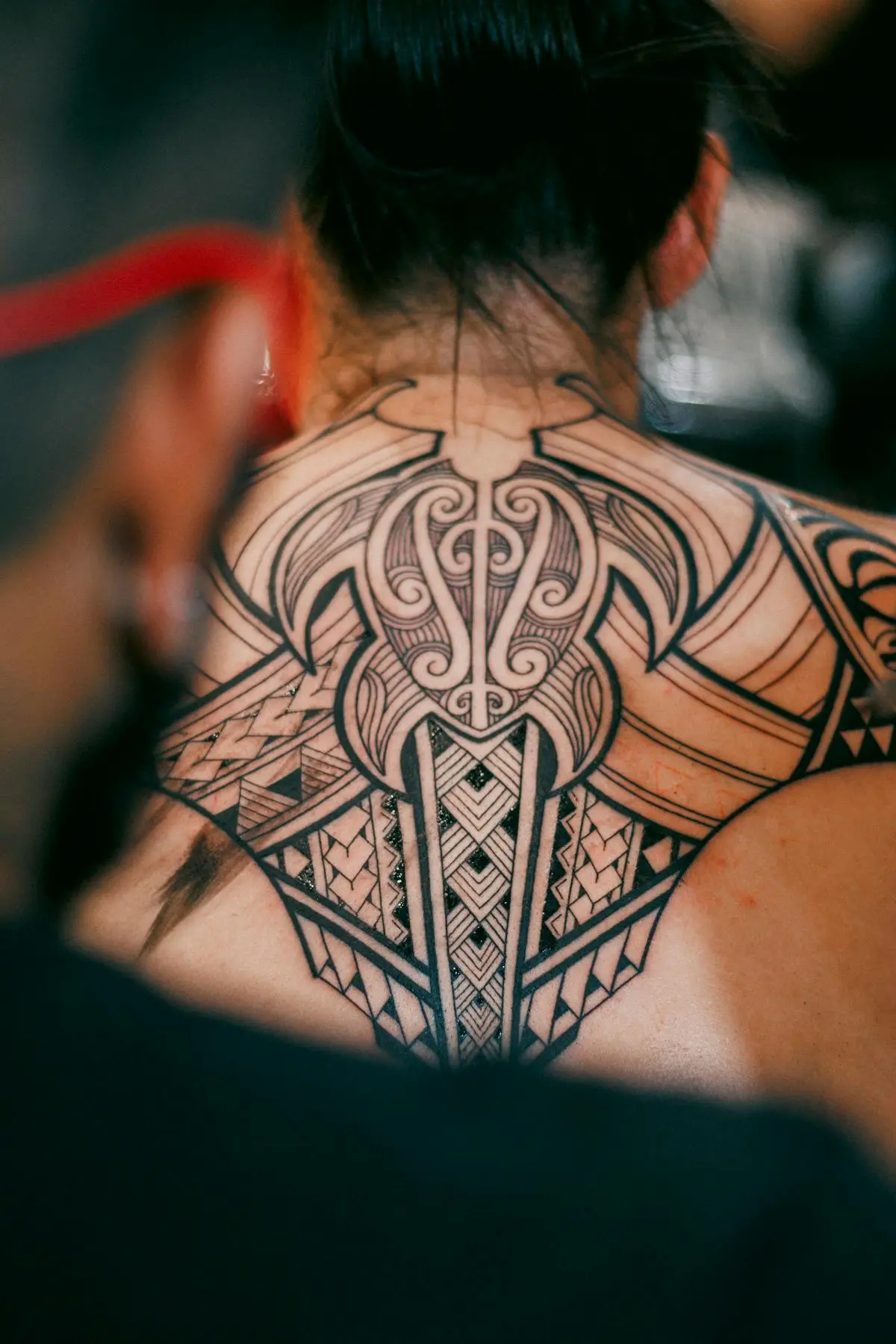
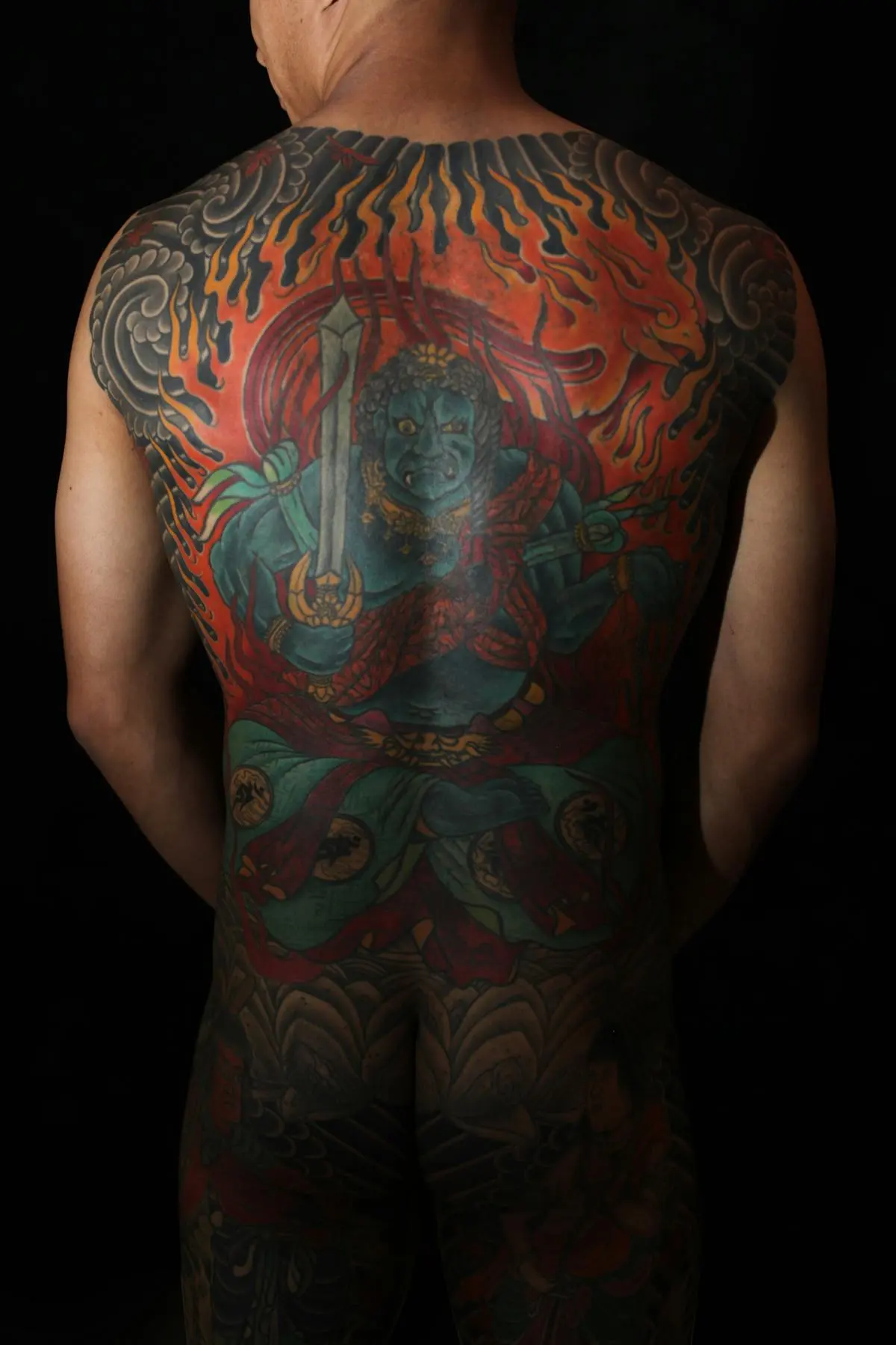
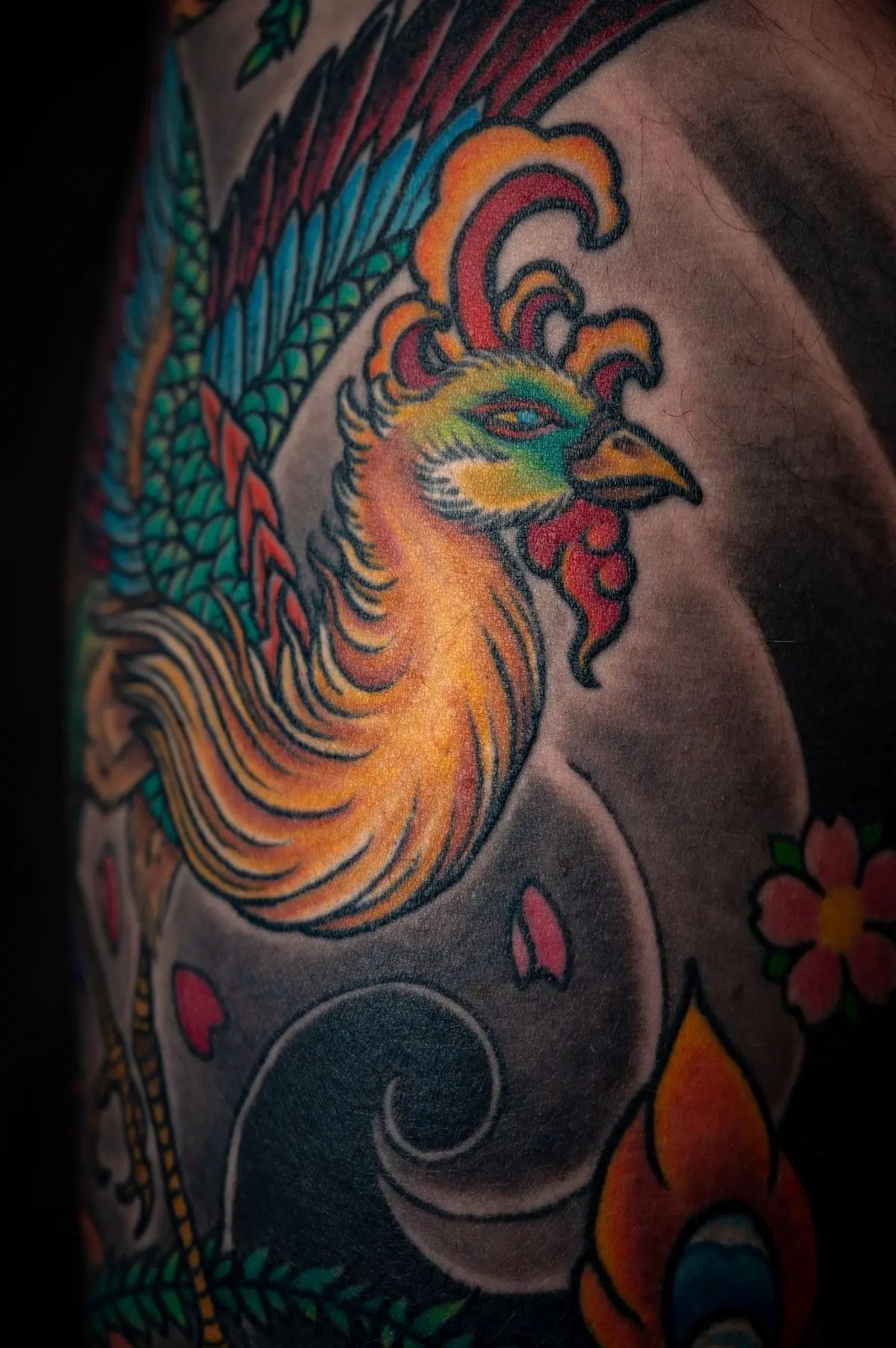
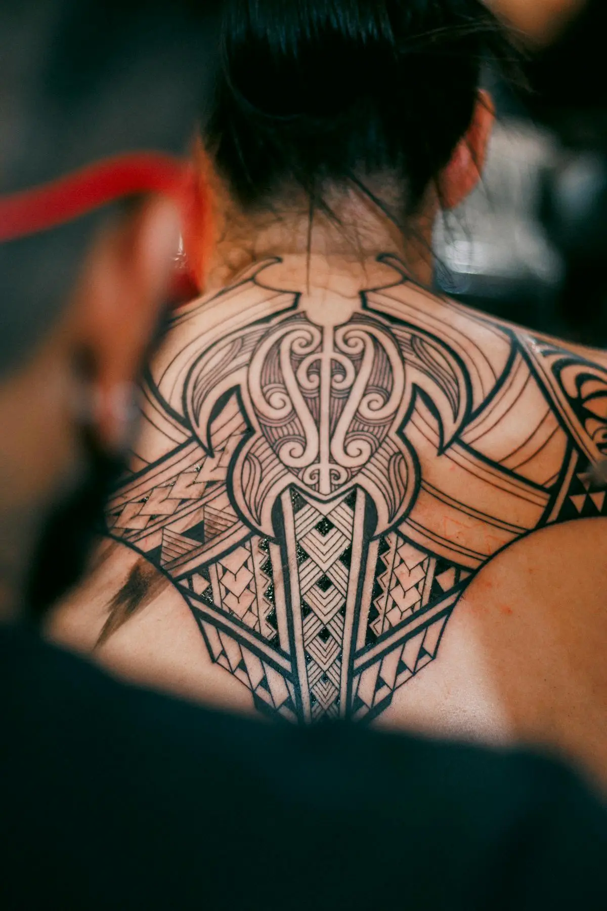
- Black-and-grey ages best for the long haul: most memorial work leans black-and-grey precisely because it stays crisp and timeless. Add color only where it genuinely matters, knowing it will soften faster than black.
Placement matters as much as style
Friction and sun drive aging more than anything else. Ourplacement guide groups the body into three tiers, which are the same tiers the simulator uses:
- Low wear: outer forearm, outer upper arm, calf, outer thigh, upper back, chest.
- Medium wear: inner bicep, inner forearm, inner thigh, ribs, lower belly.
- High wear: fingers, knuckles, hands, top of foot, behind the ear.
Whatever the style, the habits that slow fading are the same: sunscreen on healed skin, a proper heal in the first weeks, and a touch-up when it needs one. Thewhy tattoos fade guide and thetouch-up guide cover both.