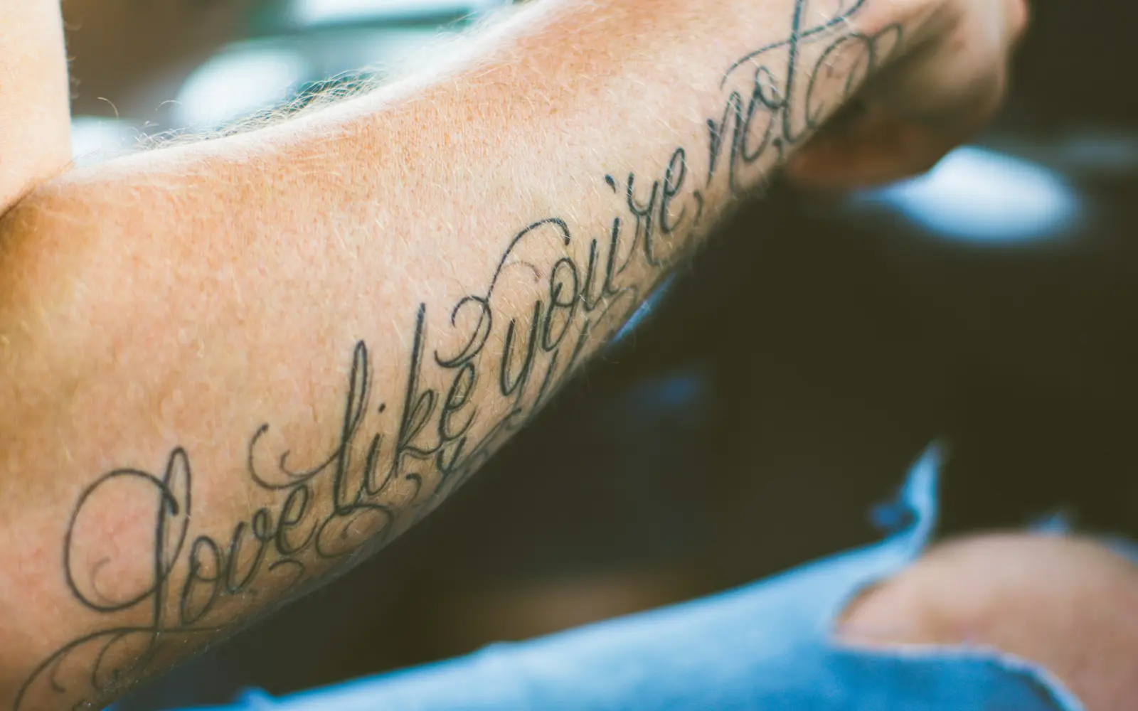
The one thing to watch
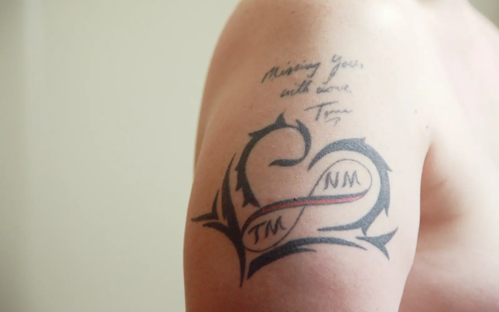
Letter size and spacing. Small script is the classic tattoo that blurs.
What the style itself demands
From the Lettering & Script style guide, the rules that decide how well it lasts:
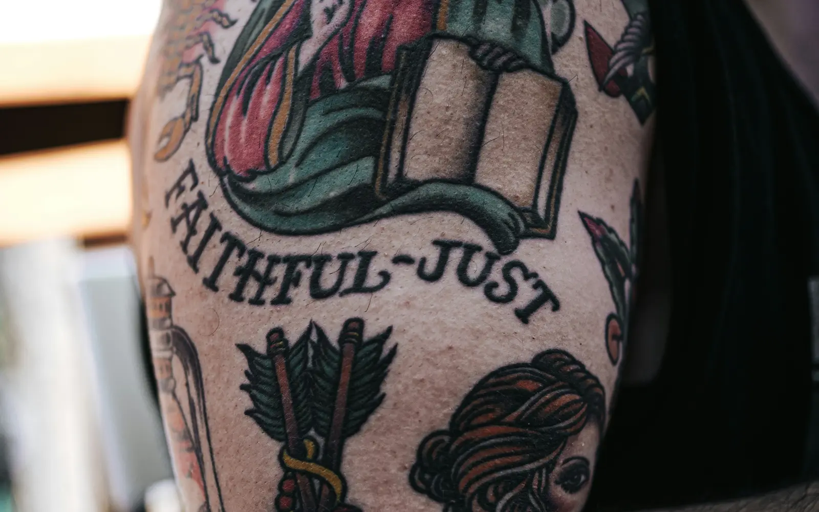
- Hand-drawn beats a typed font: a font dropped from a computer rarely flows with the body or the placement. Skilled lettering artists draw the piece by hand so spacing, weight, and curves are tuned to the spot.
- Stroke weight must survive aging: thin, hairline letters and tightly packed words can blur together over years as the skin spreads ink. Sizing the text and stroke thickness for longevity is part of the craft.
- Placement should follow the text's flow: a line of script runs naturally along the forearm, ribs, or collarbone. Forcing a long phrase into a spot that fights its direction breaks the rhythm and the readability.
Common questions about Lettering & Script aging
Do lettering tattoos age well?
They age well when the stroke weight and spacing were sized for longevity from the start. The most common failure isn't the design: it's letters set too thin or too close together, which blur into an unreadable smear as skin spreads ink over years. A lettering artist who understands aging will size strokes and gaps generously even if it means a slightly larger finished piece.
Placement matters as much as style
Friction and sun drive aging more than anything else. Ourplacement guide groups the body into three tiers, which are the same tiers the simulator uses:
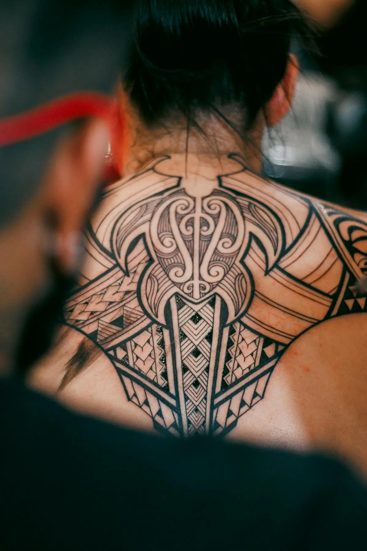
- Low wear: outer forearm, outer upper arm, calf, outer thigh, upper back, chest.
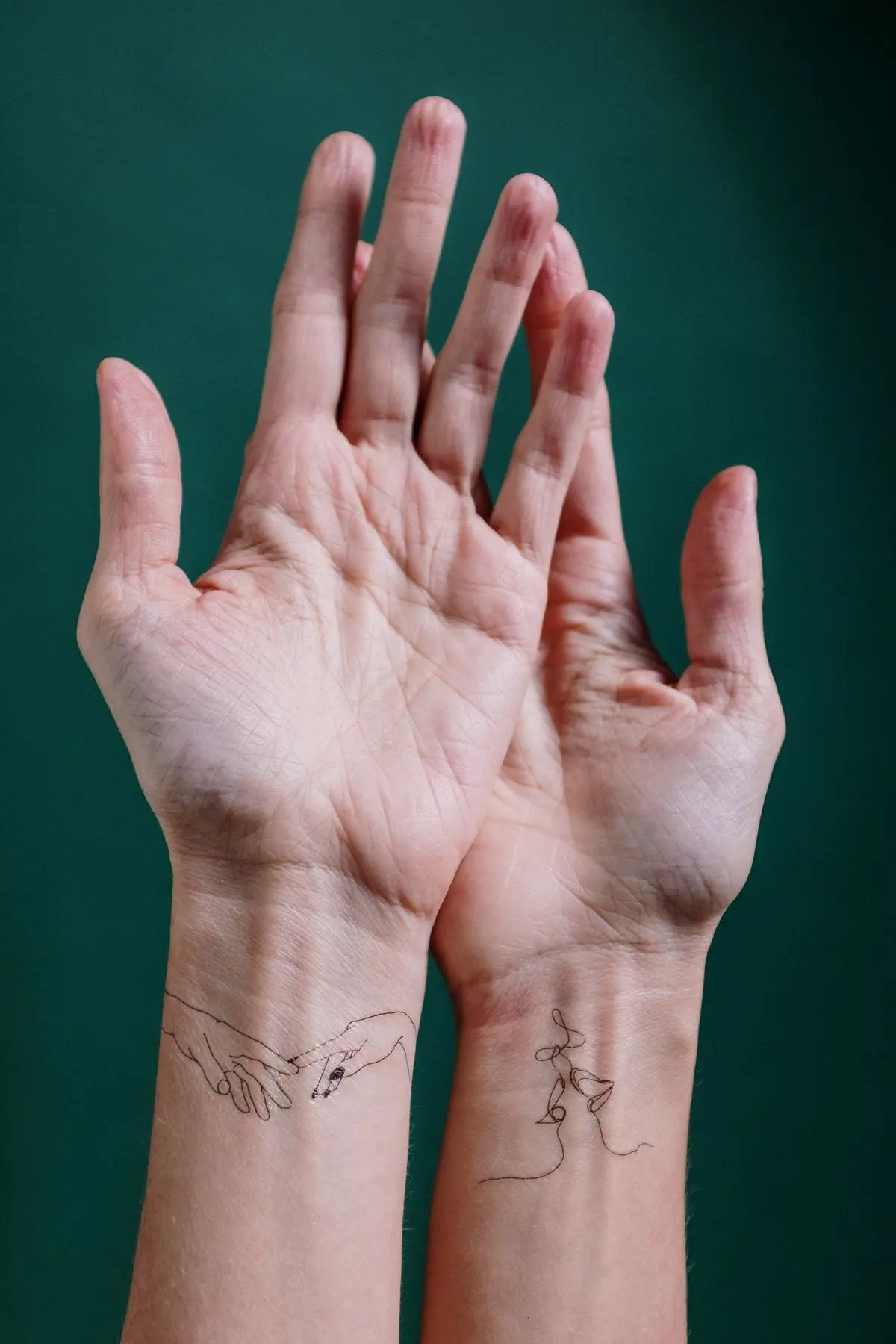
- Medium wear: inner bicep, inner forearm, inner thigh, ribs, lower belly.
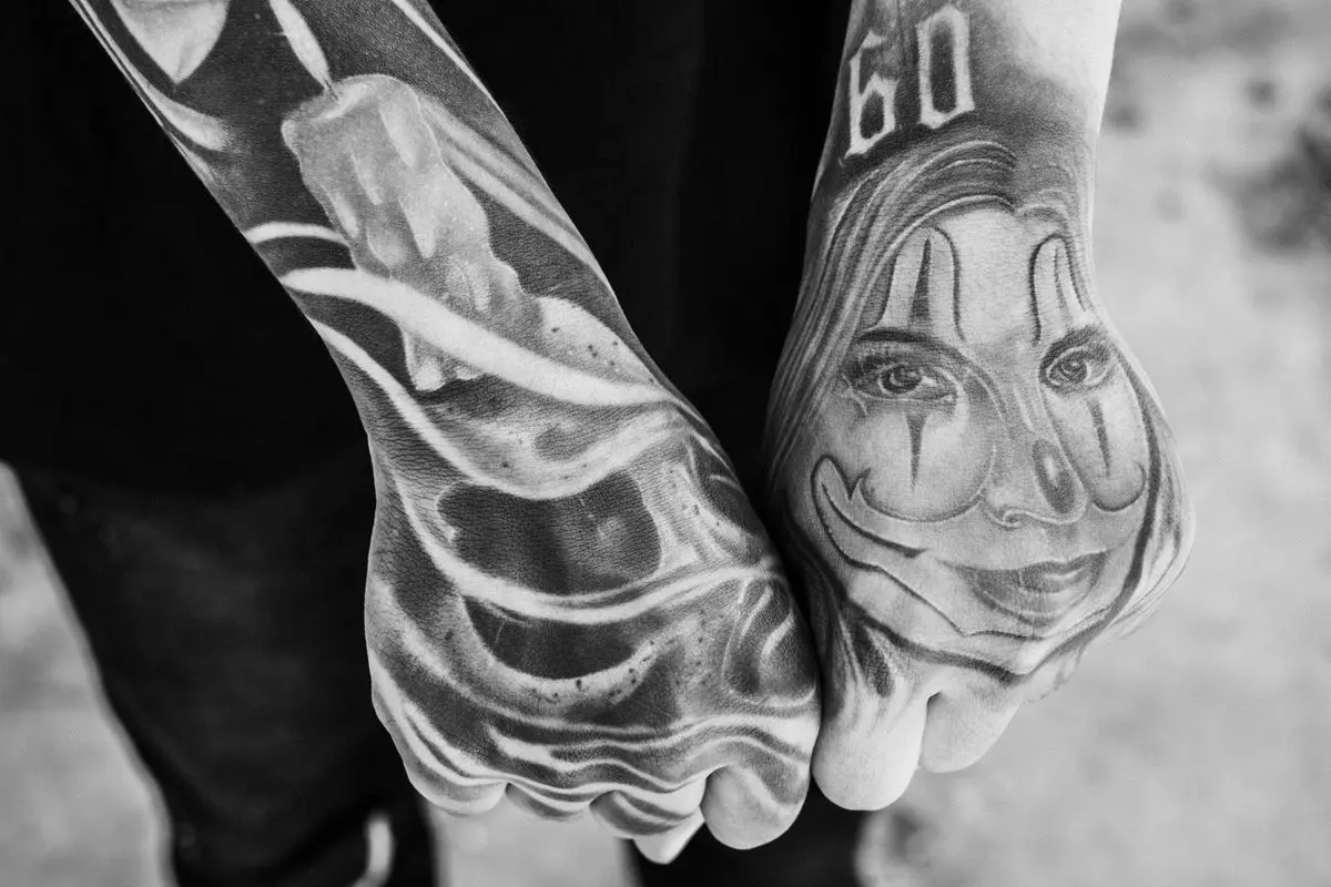
- High wear: fingers, knuckles, hands, top of foot, behind the ear.
Whatever the style, the habits that slow fading are the same: sunscreen on healed skin, a proper heal in the first weeks, and a touch-up when it needs one. Thewhy tattoos fade guide and thetouch-up guide cover both.