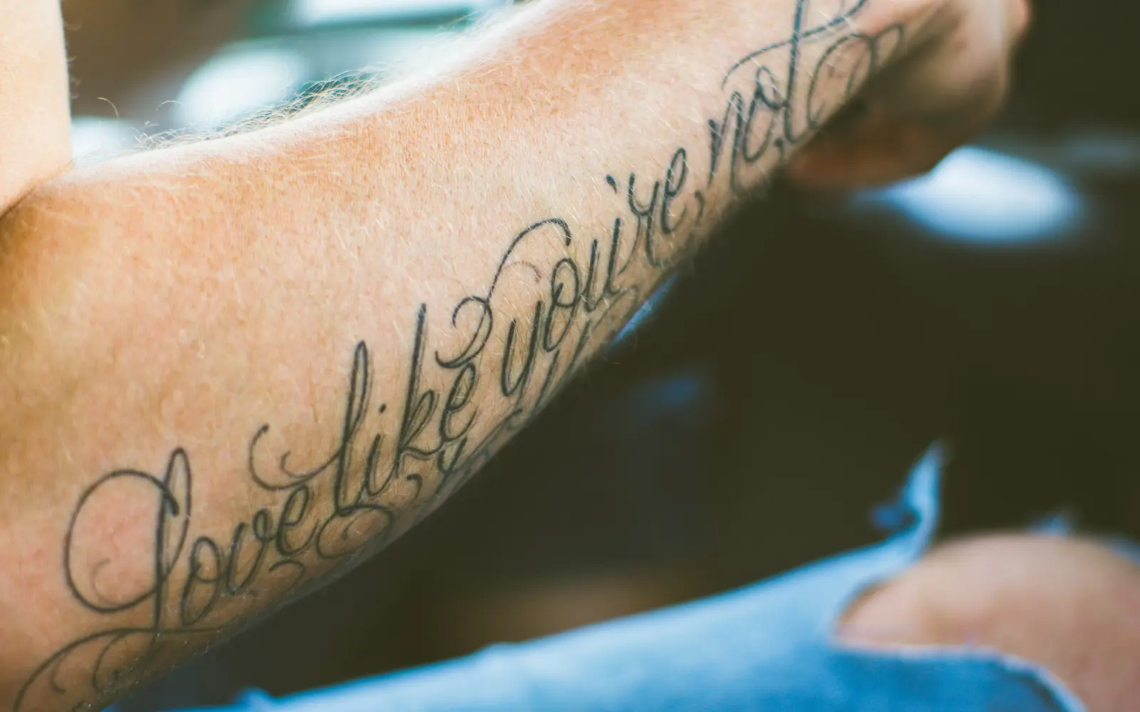
Lettering makes the writing itself the tattoo: a quote in flowing script, a name in elegant calligraphy, a single word in heavy blackletter. It's one of the most-requested styles and one of the most underestimated: good lettering is a discipline in its own right, built on letterform, spacing, rhythm, and weight, not just 'picking a font.' The two failure modes are brutal and permanent: a typo, and letters set so thin or so cramped that they blur into an unreadable blob after a few years. The fix is the same in both cases: a real lettering artist who hand-draws the piece, proofreads it obsessively, and sizes the strokes to survive aging. Lettering splits into a handful of real substyles, and picking the right one matters more than picking a favorite quote. Flowing script and cursive read as personal and intimate: the default choice for names, dates, and short phrases. Blackletter (also called Old English or gothic) carries weight and formality and holds up better at larger sizes than delicate script does at the same scale. Fine serif and brush lettering sit in between: cleaner than script, less heavy than blackletter, and a common pick for single words or short mantras. None of these is objectively 'best': the right choice depends on the words, the placement, and how small the piece needs to be. Foreign-language and translated lettering deserves its own warning. Machine-translated phrases and quotes lose grammar, gender, and idiom constantly, and a literal word-for-word translation can read as nonsense, or something embarrassing, to a native speaker. If you want text in a language you don't speak fluently, get it checked by an actual native speaker before it's inked, not just translated once and trusted. The same discipline applies to calligraphic scripts like Arabic or Chinese: a beautiful-looking character with the wrong stroke order or a transliteration error is still a permanent mistake, just a quieter one.
Pick this style if...
- Quotes, names, dates, and meaningful words
- Forearm, ribs, collarbone, and spine placements
- Pairing a phrase with an illustrative or traditional piece
Skip this style if...
- You're not certain about the exact wording or spelling
- You want very small text that has to last decades
- You'd pick a computer font over a hand-drawn design
Notable artists
A starting point. Follow their work, don't just book the first DM-slot you can get.
- BJ Betts
- Norm Will Rise
The rules of the style
- Proofread relentlessly: a misspelling, wrong date, or bad translation is permanent. Confirm the exact text, language, and any special characters with the artist before the needle touches skin, ideally more than once.
- Hand-drawn beats a typed font: a font dropped from a computer rarely flows with the body or the placement. Skilled lettering artists draw the piece by hand so spacing, weight, and curves are tuned to the spot.
- Stroke weight must survive aging: thin, hairline letters and tightly packed words can blur together over years as the skin spreads ink. Sizing the text and stroke thickness for longevity is part of the craft.
- Spacing and rhythm carry legibility: the gaps between letters and words matter as much as the letterforms. Even, deliberate spacing is what keeps a quote readable years later.
- Match the script to the message: flowing script, formal calligraphy, and heavy blackletter each carry a different tone. The style of the lettering should suit the meaning of the words, not just look fancy.
- Placement should follow the text's flow: a line of script runs naturally along the forearm, ribs, or collarbone. Forcing a long phrase into a spot that fights its direction breaks the rhythm and the readability.
Color palette
- Black
- Black & grey (shading and drop shadows) (secondary)
Lettering is overwhelmingly black, often with grey shading or a drop shadow for depth. Color exists but is the exception; solid black keeps text crisp and legible the longest.
Aftercare for this style
Lettering heals cleanly compared to shaded or color-heavy styles, since it's usually solid black line work, but thin strokes carry their own risk: over-scratching or picking during the peel phase can pull out fine hairlines and open small gaps in a word before it's even fully healed. Expect the outline to look sharp within a day, then dull and slightly raised for a week to ten days as it peels. Resist touching it. Once healed, moisturize consistently and use SPF 30+ on visible placements: sun exposure is the single biggest cause of lettering fading into illegibility over the years, more than the ink itself.